

Fun with Graphs: 2013 Minneapolis election
Graphs concerning the results of the elections
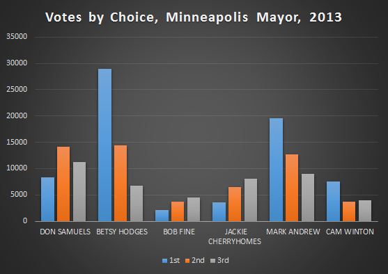
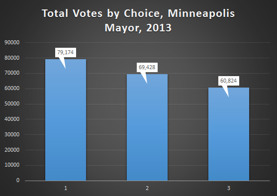
We begin with some graphs concerning the actual results of the actual elections. First up, a graph of the top Mayoral vote getters number of 1st, 2nd and 3rd choice votes.
And a line graph of just the top three by round.
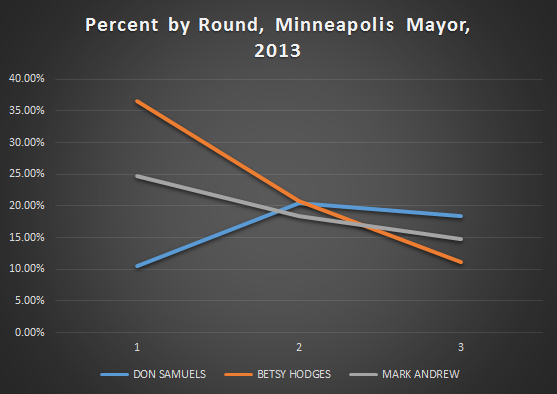
Both of these graphs show, to varying degrees, why Betsy Hodges won. She won because she crushed her closest competitors in first choice votes. Not only that, she got more second choice votes then anyone else got of any kind of vote, except for Mark Andrew’s first choice votes.
This combination of a big lead in first choice votes and a lead, however small, in second choice votes would be very difficult to overcome for a candidate in Mark Andrews position.
What he would need to have happen, is he would need for a large chunk of Betsy Hodges second and third choice votes to be blocked by his own votes, and at the same time he would need a large chunk of his second and third choice votes to not be blocked by Betsy Hodges votes.
Since they were the two leading DFL candidates in the race, it’s difficult to fathom that the distribution of votes would fall that way. And they didn’t, as we’ll see later, Betsy Hodges actually did much better in the reallocation process than Mark Andrew did.
This next graph illustrates a) how thoroughly Abdi Warsome defeated Robert Lilligren in the third precinct, but also b) that he still would have won the race even if no one in the third had cast a single ballot.
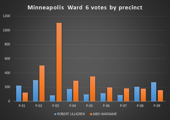
Well, you can’t actually see point b in the graph, but if you eliminate the third precinct from the totals, Warsome would still have gotten 53% of the first choice votes. Warsome’s win was as impressive for it’s breadth, as much as for it’s depth.
Graphs concerning the differences in First, Second and Third place votes
Here we explore the differences in numbers of 1st, 2nd and 3rd place votes, starting with total votes for Mayor.
In the Mayors race there was a 12% decrease in the number of votes between each round. So even with a field of 35 candidates, 12% of people who chose a first choice didn’t choose a second or third choice and 12% of the people who chose a first and second choice didn’t choose a third choice.
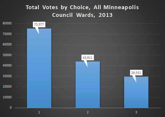
Now the total votes for all the city council races by choice.
And since some of those races featured either; one candidate, or one candidate who got over 70% of the vote, here is a graph of just the competitive city council races (3,4,5,6,9,10,11,12,13).
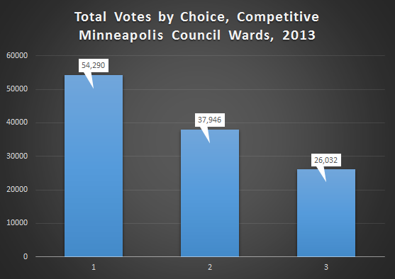
In the city council races the drop-off from round to round was much more pronounced then in the Mayors race. Even just looking at the competitive races there was a 30% drop-off from round to round. Less then half of the people who cast first choice votes in a competitive city council race also ranked someone third.
Here’s a graph with each individual ward.
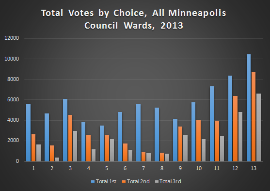
In wards 7 and 8 there was a single candidate on the ballot, so that explains the large drop off in votes after the first. In wards 1 and 2 the candidate who won did so with at least 75% of the vote, so these races were blow outs. The rest of the races (except for ward 6 where there was an active “don’t rank” campaign) had a more gradual decay in the total number of votes from first choices to third choices.
In fact, there wasn’t much difference in the amount of decline between the second choice and the third choices no matter which races you include. The largest deviations are in the differences between the number of first choice votes and the number of second choice votes.
Graphs concerning the actual Ranked Choice Voting Process
The next series of graphs are meant to illustrate logistical aspects of the Ranked Choice Voting process more than anything else.
First up, a graph of the percentage of votes reallocated to each candidate, per round, in the Mayors race vote reallocation process.
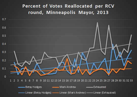
All three lines are rather noisy, but the trend lines are clear, ballots become exhausted quicker than they end up in either of the two front-runners piles. But they tend to end up in Betsy Hodges column more then Mark Andrews the furthers along things go.
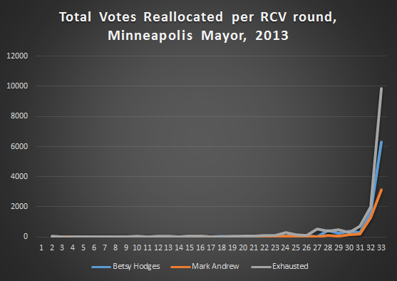
But all of this noise sort of distracts from what’s really going on; well, the noise and the fact that the graph is representing percentages of reallocated ballots as opposed to actual number of ballots.
The reality is that for the first 30 some rounds of vote counting, nothing much was changing, it wasn’t until the very end that things started to really move.
These next two graphs might be a little difficult to wrap your head around, so bear with me. The first graph shows how the votes got reallocated between the candidate with the most first place votes, the candidate with the second most first place votes, and the ballots that ended up exhausted.
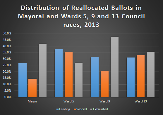
In both the Mayor’s race and the ward 9 race, the candidate with the most first place votes, Betsy Hodges and Alondra Cano, got more of the redistributed votes than the trailing candidates, Mark Andrew and Ty Moore, did. In both cases however, more ballots were exhausted than reallocated.
Wards 5 and 13 had different trends, in ward 5 more votes were reallocated to the front-runner, Blong Yang, and the trailing candidate, Ian Alexander, than ended up exhausted. While in ward 13, the trailing candidate, Matt Perry, actually added more votes than the front-runner, Linea Palmisano, but it wasn’t enough to overcome her first vote lead.
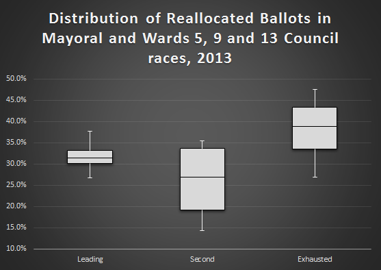
Four data points is too small a population from which to draw conclusions, but it’s still interesting to look at the graphs. The graph below is what happens when you put all these races together in the form of a box plot.
This has been an edition of “Fun with Graphs.”
Thanks for your feedback. If we like what you have to say, it may appear in a future post of reader reactions.